Quick Answer
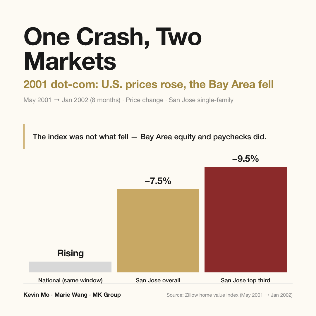
National home prices are set by employment and mortgage delinquency, not by equities — in three of the largest market crashes on record, prices held twice. The Bay Area is the exception. Here the Nasdaq is a payroll for several hundred thousand households, and in 2001, while national prices were rising, San Jose fell 7.5% in eight months.
Who this article is for
- Bay Area technology families holding a large RSU or option position and weighing whether to transact now
- Buyers planning a $5M+ purchase on the Peninsula or in the South Bay who want the worst case sized before they commit
- Owner-occupiers already in a Bay Area home, watching the AI complex sell off and wondering whether it reaches their balance sheet
- Long-horizon holders who want to know how long a crash-driven correction takes to repair, and whether they can sit through it
- Readers trying to separate what 2026 shares with 2001 from what it does not
Three ways to read the question
This is really two questions wearing one coat. The national market is one question. The Bay Area is another. Answer them together and you land on "stocks fell, so houses must fall" — a conclusion that matches neither the historical record nor the way money actually moves here.
One: nationally, the signal is jobs and delinquency, not the index
Line up the three largest equity drawdowns since 1979 against national home prices and the result is counterintuitive. After a crash, prices have held flat, risen, and fallen — all three have happened. What actually sets the direction is a pair of less glamorous series: the unemployment rate and the mortgage delinquency rate. The chain is plain. People lose jobs, then they stop paying. Enough missed payments, and prices move. A falling index by itself is frightening, nothing more.
The reason 2008 broke prices is that the sequence ran the other way. Subprime lending made housing sick first, and housing dragged equities down with it. It is not a case of a crash transmitting into home prices. It is a case of a housing crisis transmitting into a crash.
Two: in the Bay Area, the signal is the paycheck the Nasdaq writes
The rule above does not hold here, and the evidence is not an argument — it is two receipts.
The first is the dot-com unwind. Over the eight months from May 2001 to January 2002, San Jose home prices fell 7.5%, and the top third of the price range fell 9.5%. National prices rose over the same window.
The second is 2022. The Nasdaq gave back roughly a third that year. National prices cooled briefly and then set new highs, while the San Francisco metro Case-Shiller index peaked in June 2022 and today still sits about 9% below that peak.
Twice the country was fine and the Bay Area took the hit, because in both episodes the epicenter was not Wall Street. It was Silicon Valley. What fell was not only share prices; it was the equity and the wages of Bay Area households. Money travels from the market into Bay Area home prices through three channels.
- RSUs are the local payroll. Compensation here runs a $200K–$300K base against $400K–$500K in stock. When the Nasdaq gains 16%, that is not a brokerage statement getting larger — it is the annual income of several hundred thousand households moving. Mortgage underwriting already treats it that way. Fannie Mae Selling Guide B3-3.3-07 allows RSUs as qualifying income, valued on a 200-day average share price, generally requiring about two years of vesting history and capped at roughly 35% of total income. The loan file grades stock as wages. The country at large has no such channel. This one runs straight through the Bay Area.
- The IPO, lockup, and M&A calendar. Federal Reserve wealth distribution data puts about half of all U.S. equities — roughly $27 trillion — in the hands of the top 1% of households, with the top 10% holding 93%. The wealth effect from equities is concentrated in a small number of families to begin with, and the Bay Area is where those families are densest. Their wealth also arrives on a published schedule. The calendar turns a page and a cohort of cash walks in.
- The reverse channel: layoffs. When share prices stay down long enough, companies cut. Meta's 16,000-person reduction is the type case. That is when the Bay Area takes two hits at once: the equity is worth less and the job is gone. Every time the news turns, entry-level buyers are the first to brake.
The three channels compress into one line. National prices follow rates. Bay Area prices follow the paycheck the Nasdaq writes.
Three: the entry tier is at a record low — and it is queued up in the rental market
One loop has gone largely unremarked for the better part of a year. The latest NAR reading puts first-time buyers at 21% of all buyers, the lowest since the series began in 1981, against a historical norm near 40%. The median first-time buyer is now 40 years old, also a record.
That missing half of the down-payment cohort did not leave the market. It moved next door, into rentals. Buyers became renters, and rents felt it: San Francisco rents are up roughly 22% over the year, San Jose somewhere between 5% and 11% depending on the series, with a median near $3,300 — second most expensive in the country.
Now the boomerang is coming back. Over the past several months the industry has begun to see a returning buyer: households that rates talked out of buying last year, who decided to rent and watch, and who came back to look at entry-level homes the moment their landlord raised the rent. How much you put down is a design choice. How much rent goes up next year is not. What they are buying is not a discount — it is certainty. Demand at the entry tier has not died. It is standing in line in the rental market, and every additional year of rent increases pushes another slice of that line back toward buying.
The data: three crashes, a current checkup, and the 2001 sandbox
After a crash, home prices do not reliably follow
The core numbers first. The market fell 33.5% in three months in October 1987 and national home prices barely moved. Through the 2000–2002 dot-com unwind the market lost 49%, and inflation-adjusted home prices rose 15%. Only in 2008, with equities down 57%, did prices genuinely break — and that was the episode where housing got sick first and pulled the market down with it, the opposite of the intuitive order.
| Period | Equity drawdown | National home prices | Direction of causation |
|---|---|---|---|
| October 1987 | −33.5% in 3 months | Barely moved | Equity-only decline |
| 2000–2002 dot-com | −49% | Real (inflation-adjusted) prices +15% | Equity-only decline |
| 2008 | −57% | Genuine decline | Housing first, equities after |
What to remember: in three episodes, prices followed once, and that one time the disease was in housing itself rather than in the market. "Stocks fall, therefore homes fall" has never been a dependable transmission chain. The series worth watching are employment and missed payments.
The employment and credit checkup, July 2026
The core numbers first. Unemployment is 4.2% on the Bureau of Labor Statistics June reading, below May. Initial jobless claims for the week of July 18 came in at 187,000, described in press coverage as near a 60-year low. Mortgage delinquency stands at 3.93% on the MBA's second-quarter reading, well under the 5.21% average since 1979. Put together, the three say one thing: the market is shaking, but nobody is losing jobs at scale and nobody is missing payments at scale.
| Indicator | Latest reading | Reference |
|---|---|---|
| Unemployment rate | 4.2% (June) | Below the May reading |
| Initial jobless claims | 187,000 (week of July 18) | Reported as near a 60-year low |
| Mortgage delinquency | 3.93% (Q2) | 5.21% average since 1979 |
| National job gains, June | 57,000 | Unemployment still low, hiring slowing |
What to remember: what ails the national housing market right now is price and rates, not a crash. U.S. financial press has been circulating a phrase for it — the new-owner penalty. A new buyer spends 26% of income on housing where an existing owner spends 20%, and that six-point gap is the widest since 1990. That is a purchasing-power problem, not an asset-quality problem, and the two have completely different consequences. Also note the quieter line in the table: June added only 57,000 jobs nationally. Unemployment is low, hiring is slowing. The surface is calm; the current underneath is changing.
If history repeats: magnitude and time to recover
The core numbers first. The DataQuick monthly report published May 23, 2001 showed Bay Area sales volume down 15.8% year over year, a fifth consecutive monthly decline, with San Mateo volume off 27.9% and Santa Clara off 16.5%. Pair that with Zillow's price series and you get San Jose down 7.5% over eight months and the high end down 9.5%. On the recovery side, the San Francisco metro median took 11 months to regain its prior peak and the high end took 15; San Jose metro was hurt worse, with the low end back in roughly a year, the median in 28 months, and the top tier in 35.
| Measure | 2001–2002 reading | Note |
|---|---|---|
| Bay Area sales volume (YoY) | −15.8% | DataQuick, May 2001 report; fifth straight monthly decline |
| San Mateo sales volume | −27.9% | The more expensive the market, the sharper the drop |
| Santa Clara sales volume | −16.5% | Same period |
| San Jose home prices (8 months) | −7.5% | May 2001 → January 2002 |
| San Jose top third of price range | −9.5% | The high end fell further |
| SF metro recovery (median) | 11 months | Back to the prior peak |
| SF metro recovery (high end) | 15 months | Slower than the median |
| San Jose metro recovery (low end) | About 12 months | The bottom recovers first |
| San Jose metro recovery (median) | 28 months | — |
| San Jose metro recovery (top tier) | 35 months | Close to three years |
Two things to remember. First, if history repeats, the magnitude to work with is a 7%–10% adjustment in Bay Area prices overall, deeper as you move up in price, with the Bay Area moving first and the country lagging or not moving at all. Second, the order of the recovery mirrors the order of the decline — the low end returns first, the high end last — but the full sentence matters: even the worst-hit top tier was back at its prior high within three years. That is the difference between a crash-driven correction and a credit crisis. It is a deep V, not a long grind.
Sources: historical equity drawdowns matched against national home prices; the DataQuick May 2001 monthly report; Zillow price and recovery time series; San Francisco metro Case-Shiller index; Bureau of Labor Statistics employment data; MBA second-quarter mortgage delinquency; NAR first-time buyer report; Fannie Mae Selling Guide B3-3.3-07; Federal Reserve household wealth distribution data. All-cash shares are from MK Bay Area Pulse 2026 Q2, built on public MLSListings closings.
Updated: 2026-08
Scope: U.S. national home price indices plus the San Francisco Bay Area (San Francisco and San Jose metros, principal Peninsula and South Bay cities), single-family homes. The crash-versus-prices comparison is compiled from public historical index data. Rent growth figures and the new-owner penalty calculation follow the definitions used in public reporting; methodologies differ across sources, so treat them as directional. This is forward-looking market analysis, not a forecast or a promise about future prices.
What MK Group sees in the field
The real difference between 2026 and 2001 is whose money is buying
DataQuick kept a long series on this: from 1988 onward, the Bay Area's all-cash share of purchases averaged just 12.3% a month, and not until 2012 did a monthly reading break out of that long-run range. Which means roughly nine in ten buyers in 2001 were financed, and for many of them the down payment itself had been raised by selling stock. When the market broke, the down payment evaporated and the mortgage payment did not. The selling pressure in that cycle was forced.
Today's structure is different, and this time there is public data to check it against. MK Bay Area Pulse 2026 Q2, built on public MLSListings closings, shows the all-cash share of Bay Area sales at 15.7% in the $1.5M–$3M band, 26.8% in $3M–$5M, 44.4% in $5M–$10M, 71.8% in $10M–$20M, and 75.0% above $20M. By city, Atherton is at 64.5%, Woodside 74.2%, and Hillsborough 52.1%, with Palo Alto, Los Altos and Menlo Park all clustered around 34%–36%. Layer on a 3.93% delinquency rate and the picture is an owner base with no monthly payment pressure and nobody able to force their hand.
That cushion has a clear edge to it, and Marie Wang and Kevin Mo make the point repeatedly at the luxury end: all-cash determines whether someone is forced to sell. It has no bearing on whether anyone wants to buy. All-cash buyers are usually the buyers who can just as easily do nothing, and when sentiment cools they pull back faster than anyone. That is why the luxury tier was the first thing to freeze in 2022.
How AI wealth actually turns into Bay Area luxury closings
Two MK Group transactions show the second channel working in practice. In late 2025, a family employed at a leading Silicon Valley AI company held a large pre-IPO position — substantial on paper, unusable as cash. MK Group connected them with professional secondary-market buyers to realize liquidity in tranches, and the family closed all-cash in Los Altos Hills, negotiating more than $1M off in the process. In the second, a technology professional was touring homes in early 2024 on a $2M–$2.5M budget; after being recruited away by a major company on a large equity package, they closed in early 2026 on a newly built one-acre estate in Atherton at roughly $20M. Two years, and the budget moved an order of magnitude.
What the two share is that their purchasing power tracked the vesting and liquidity calendar, not wage growth and not rates. That is precisely why the Bay Area luxury tier is far more sensitive to the Nasdaq than the national market is — and the same mechanism runs in reverse on the way down.
Common misconceptions
Misconception one: "A big market decline means home prices must follow"
In three major crashes, prices genuinely fell once, and that once — 2008 — began with housing and spread to equities, the reverse of the assumed order. When the market fell 33.5% in three months in 1987, national prices barely moved. When it fell 49% from 2000 to 2002, inflation-adjusted prices rose 15%. What sets the direction is unemployment and mortgage delinquency: people lose jobs before they miss payments, and missed payments come before forced selling.
Misconception two: "Cash shares are so high here that prices can't fall much"
A high cash share blocks one category of risk, and only that one. MLSListings data puts the all-cash share at 71.8% in the $10M–$20M band and 64.5% in Atherton, which means almost nobody will be forced to sell over a mortgage payment. The forced-seller channel is effectively closed. But all-cash buyers are also the buyers with no obligation to act, and when sentiment cools they are the first to step back. The Bay Area luxury tier froze first in 2022, and what froze was demand, not supply.
Misconception three: "If it really breaks, it's a decade-long grind back to even"
The last cycle's recovery times are on the record. The San Francisco metro median regained its prior peak in 11 months and the high end in 15. San Jose metro's low end took about a year, the median 28 months, the top tier 35. Even the worst-hit segment was back at its prior high within three years. A crash-driven correction is shaped like a deep V, and it is not the same animal as the slow bear that followed the collapse in credit quality in 2008 — provided employment holds.
Misconception four: "Nobody is buying at the entry level, so that demand is gone"
First-time buyers at 21% is the lowest share since the series began in 1981, but those households did not leave the market. They queued up in the rental market instead. San Francisco rents are up roughly 22% over the year and San Jose's median rent of about $3,300 is the second highest in the country. Every additional year of rent increases pushes another slice of that queue back toward buying. Over the past several months the industry has started to see households that rates talked out of buying last year come back to look after a rent increase. What they are buying is not a discount — it is certainty.
Misconception five: "Watching the Nasdaq is enough"
The Nasdaq only tells you the direction of the wealth effect. The dividing line is whether it escalates into layoffs, and the instrument for that is initial jobless claims. Today's 187,000, paired with 4.2% unemployment, is the combination that reads as a shaky market over an intact labor market. If that number trends from today's 187,000 up toward 250,000 or 300,000, the script changes to the 2022 version — the Bay Area moves first and moves deeper. Watch the two series together rather than the index alone.
Three conditional paths
These are not predictions. They are different premises mapped to different responses.
- If the decline is profit-taking and employment holds — the Bay Area luxury tier takes a breather, and the entry tier keeps watching rates.
- If the equity decline escalates into layoffs (initial claims trending from today's 187,000 toward 250,000 or 300,000) — the likely script is 2022 again: the Bay Area adjusts first and adjusts deeper than the country. Read that against the recovery table, though, where the worst-hit segment was back at its prior high within three years.
- If AI wealth keeps converting and the IPO calendar keeps turning — the luxury tier may decouple from the broad market in the short run and trade on its own logic.
Next steps
- Replace the question. Stop asking how far the market will fall and start watching two numbers: initial jobless claims (currently 187,000) and mortgage delinquency (currently 3.93%). A sustained break higher in the first is the signal to change pace.
- Work out how much of your income is RSUs. If equity is approaching or above 35% of household annual income, your borrowing power is far more sensitive to the Nasdaq than instinct suggests — that ceiling is written into the Fannie Mae rules themselves.
- Assess risk by price band, not by city. The higher the band, the tighter the link to equities, the deeper the decline, and the slower the recovery. The entry tier tracks rates and rents instead. Establish which band you are in before discussing exposure.
- If you intend to buy, extend the horizon past three years before deciding. Even the worst-hit segment last cycle was back at its prior high inside 35 months, but a holding plan shorter than that turns a correction into a realized loss.
- If you intend to sell, establish first whether you are a forced seller. Owners without payment pressure keep full pricing authority through a crash-driven correction. Only forced sellers need to move in the first half of a volume decline — in 2001, price adjustments showed up only after five consecutive months of falling volume.
Further reading: Meta Cuts 16,000. With the 2026 Silicon Valley Layoff Wave, Will Bay Area Home Prices Crash? | Turning Pre-IPO Stock into a Bay Area Luxury Home | After the IPO Wave, Will All of Silicon Valley's Luxury Homes Push Toward $10M?